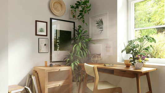

Color is more than a visual experience; it is a psychological one that can significantly affect mood and emotion in your home design. The colors you choose for your interior not only reflect your personal style but also have the power to influence your daily life. In this guide, we’ll delve into the psychology of color and offer tips on choosing the right palette for your space, all while considering the integration of our vibrant Odyssey Collection and the serene tones of our Essence Collection.
Understanding Color Psychology Each color can evoke different feelings and responses. Here’s a quick rundown of common colors and their psychological impacts:
- Blue: Often associated with calmness and serenity. Ideal for bedrooms or bathrooms.
- Green: Evokes feelings of tranquility and health. Works well in living rooms or studies.
- Yellow: Radiates happiness and energy. Best used in kitchens or dining rooms.
- Red: Symbolizes passion and excitement. Suitable for dining areas or accents.
- Purple: Conveys luxury and creativity. A bold choice for living spaces or offices.
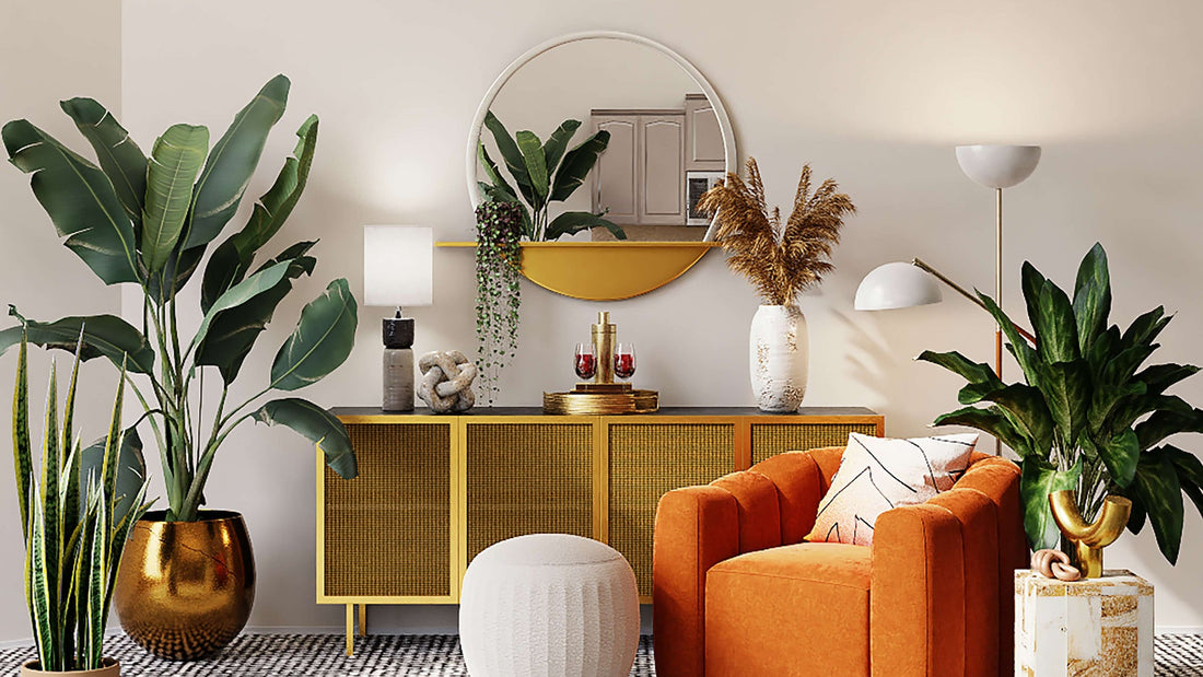
- Orange: Energetic and fun, great for exercise rooms or play areas.
- Neutral Tones: Offer flexibility and subtlety, creating a calm and elegant backdrop for any room.
Choosing the Right Palette for Your Home When selecting a color palette for your home, consider the following:
- Room Function: Think about how you use each room. Active spaces like kitchens may benefit from vibrant colors, while relaxing spaces like bedrooms may benefit from softer tones.
- Lighting: Natural and artificial lighting will affect how colors look. Test paint swatches or poster colors in different lights before deciding.
- Existing Decor: Ensure your new color scheme complements your furniture and decor. Art pieces, like those from our Odyssey and Essence Collections, can serve as inspiration for your color palette.
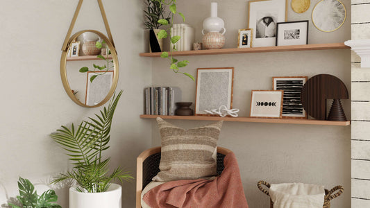
Incorporating Art into Your Color Scheme Artwork can be a starting point for your room’s color palette or a complement to it.
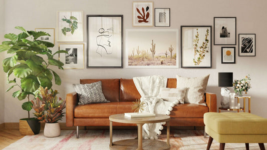
- For a harmonious look, pick posters with elements of your room’s color scheme. Our Essence Collection, with its nuanced shades and subtle designs, can elegantly tie into and enhance your existing decor.
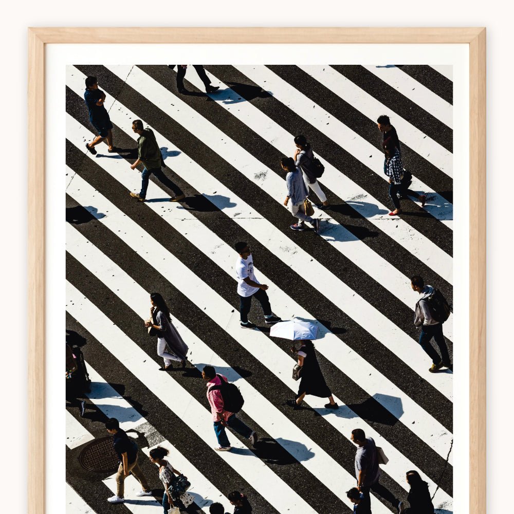
- To make a bold statement, choose art that contrasts with your room’s colors. Posters from our Odyssey Collection can introduce vibrant splashes of color to a neutral room, creating an eye-catching focal point.
Creating Balance and Harmony A well-balanced room typically includes a mix of complementary, analogous, or triadic color schemes.
- Complementary Colors: Colors opposite each other on the color wheel. They create a vibrant look when used together.
- Analogous Colors: Colors that are next to each other on the color wheel. This scheme offers more nuance and harmony.
- Triadic Colors: Three colors evenly spaced around the color wheel. This scheme is vibrant yet balanced.
Personal Preference is Key While color psychology provides a useful guide, personal preference is paramount. Choose colors that you’re naturally drawn to and make you feel good. After all, your home is a reflection of your personality.
Final Thoughts The colors you choose for your home are a reflection of your personality and can significantly impact your everyday experience. By understanding the psychology of color, you can make informed choices that not only create a visually appealing space but also contribute to your well-being. Whether you’re looking for the calming influence of our Essence Collection or the energetic vibe of our Odyssey Collection, remember that the best color palette is one that resonates with you and brings life to your home.
Explore our collections and let the colors guide you to a more beautiful, harmonious home.